I’m studying software engineering at EPITA and working as an apprentice at GE HealthCare. Lately, I’ve been leaning more toward DevOps and MLOps, spending more time with infrastructure tools and Claude Code. My portfolio hadn’t kept up. It was full of large photos, animated text and a 3D room. I liked it, but it looked more like a designer’s portfolio than the website of someone applying for engineering roles.
The old portfolio#
The old site is still online. I still like parts of it, especially the visuals. Looking at it as a recruiter might, though, I could see why it wasn’t doing me many favours.
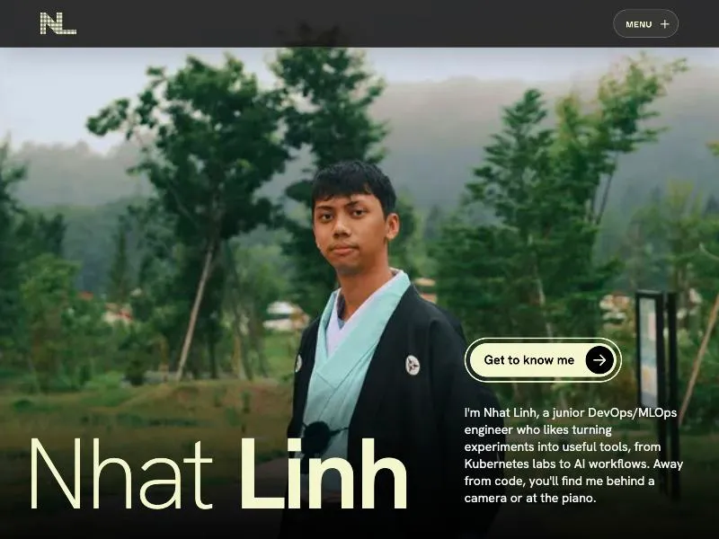
It was heavy
Before the 3D section even loaded, the page made around 30 requests totalling roughly 840 KB. That included a 400 KB hero photo, GSAP, ScrollTrigger, fonts and a loading screen. In my test, the largest content took about 5.2 seconds to appear. Chromium also complained that I’d preloaded the hero image without using it soon enough.
Then there’s room.glb in the About section, along with its Draco decoder. The model is 14.2 MB, around 17 times the
size of those initial page requests. It doesn’t do anything useful; I just thought it looked cool.
The 3D model was buggy
When I went back to test the site for this post, the model finished downloading and the button said “Loading model 100%”. The canvas was still black. WebGL was available, and the file had loaded, but the room never appeared. From a visitor’s perspective, it was just a black rectangle stuck on a loading message.
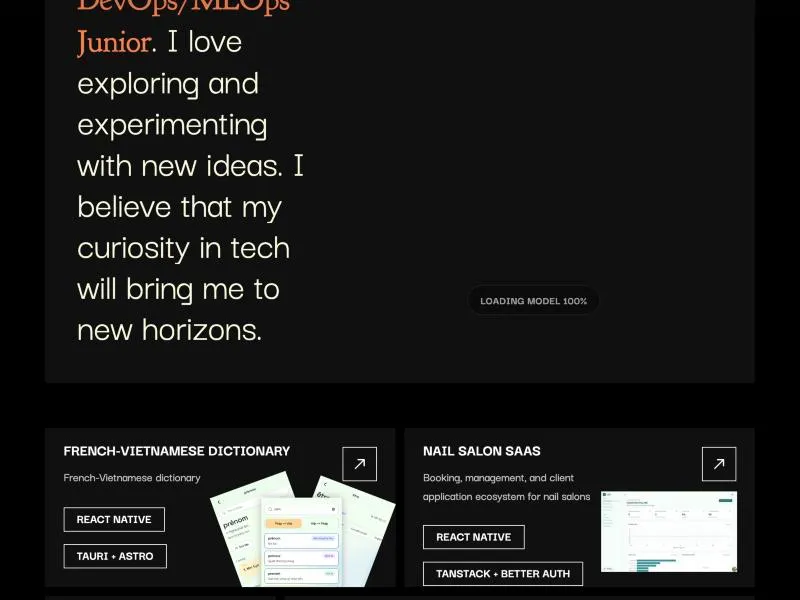
It styled me as a designer, not an engineer
I’d borrowed a lot from UI/UX portfolio designs: dark colours, a cinematic photo, text revealing word by word, and even a photography gallery with my camera and lens. I do enjoy photography, and I didn’t want to pretend otherwise. But anyone looking for my infrastructure or ML projects had to scroll past all of that first.
The text animation was awkward too. It wrapped each word in its own element. Copying the About section, or reading it with a screen reader, could leave you with one word per line.
What I wanted instead#
I use Claude regularly for school and side projects, and I’ve become pretty familiar with the little orange mascot in Claude Code. It’s a pixel creature with two eyes and four legs. I liked the idea of putting that character on my homepage and letting it do something, instead of just adding another portrait and a job title.
I set a few constraints: no 3D, no loading screen, and no frontend framework runtime. I wanted a terminal-inspired look with ASCII details and animations that assemble parts of the page. I also set myself a slightly ridiculous target: make the page’s JavaScript smaller than the old hero photo.
The idea, on my way to work#
The first version of the idea was a messy Vietnamese note I typed on my phone during my commute. Translated into English, it said:
My idea for showing myself: make my picture in ASCII, and have a Claude agent draw it from top to bottom. For that I first need to turn an existing photo of me into an ASCII version. I also want the portfolio to read like a list, with a light yellow background and orange as the main colour.
How I built it, step by step#
Most of the build happened during one long Claude Code session. I would describe an animation, try it in the browser, notice what felt wrong and ask for a change. The order below is pretty much how the site evolved.
1. From an ASCII portrait to a halftone
I started exactly as the note said: I converted a photo of myself into ASCII art made of block characters
(░ ▒ ▓ █). Here is a reduced version of that first file:
                      ░
           ░░░░░░░░░░░░ ░▒░░░
      ░░ ░ ░ ░░░░░░░░░░░░ ░░░░░░░░▒
   ░░░░░░░░░  ░   ░   ░ ░░░░░░░░░░░░▒
                ░░ ░░ ░  ░   ░  ░░░░░░░▒
 ░░                 ░              ░░ ░░
░                         ░░         ░  ░
                           ░░░          ░░
              ░      ░ ░ ░░  ░░           ░
      ░   ░░░░░░░░ ░▒▓▒▓▓▓▓▓▓▓▓▓▒          ░
 ░░░▒▒░▒▒▒▒▒▒▓▒▒▒▒▒░░▒░░▒▒▓▓▓▓▓▓▓▓▒
 ▒▒▒▒▒▒▒▒▒▒▒▒▒▒░░   ░░░▒▒▒▒▒▓▓▓▓▓▓▓░
░░▒░░░░░░░░░▒▒▒▒░░░░░░░▒▒▒▒░░▒▒▓▓▓▓▓░    ░
▒▒░░░░░░░░░░▒▓▓▓▒░░ ░▒▒  ▒▒▒▒▓▓▓▓▓▓▓▒░░░▒▓█░
▒▒░ ▒▒  ░░░░▒▓▓▓▓▓▒▒░░░░░▒▓▓▓▓▓▓▓▓▓▓▒░░▒▒▒░░▒
▒▒▒▒░░░░░▒▒▒▓██▓▓▓▓▓▓▓▓▓▓▓▓▓▓▓▓▓▓▒▒▒▒▒▒▒░░▓▒▒
▒▓▓▓▓▓▓▓▓▓▒▓████▓▓▓▓▓▓▓▓▓▓▓▓▓▓▓▓▒▒▒▒▒▒▒▓▒░▒▓▓
░▒▓▓▓▓▓▓▓▒▓▒▒▒▒▒▓▓▓▓▒▓▓▓▓▓▓▓▓▓▒▒▒▒▒▒▒▒▓▒▓▒▓▓▓
░▒▓▓▓▓▓▓▓▒░  ░░░░ ░░▓▓▓▓▓▓▓▓▒▒▒▒▒▒▒▒▒▒▓▓▓▓▓▒
 ▓▒▒▒▒▒▒▓▓▒░░▒▒▒▒▒▓▓▓▓▓▓▓▓▒▒▒▒▒▒▒▒▒▒▒░░▒▒▒
 ▒▒▒▒▒▒▒▓▒▒▒▒▓▓▒▒▓▓▒▒▒▒▒▒▒▒▒▒▒▒▒▒▒▒▒▒░▒
  ▒▒▒▒▒▒░▒░░░░░░░░░░░  ░░▒▒▒▒▒▒▒▒▒▒▒▒▒▒
    ▒▒▒░░░▒▒▒▒▒▒▒▒▒▒░▒▒▒░░▒▒▒▒▒░▒▒▒▒▒▒▒
     ▒░░▒▒▒░░░░░░░▒▒▒▒▒░░░░░░░░░░▒▒▒▒▓▓
       ░░░░░▒▒▒▒▒▒▒▒▒▒▒▒░░░░░░░░▒▒▒▒▒▓▓
         ░░▒░░░░░░▒▒▒▒░░░░░░░░░░░▒▒▒▒▓▓
           ░░░░░░░░░░░░░░░░░░░░▒▒▒▒▒▓▓▓▓██
            ░░░░░░░░░░░░░░░░░░▒▒▒▒▒▓▓▓▓▓▓▒▒▒▓██▓
             ░░░░░░░░░░░░░░▒▒▒▒▒▒▒▒▓▓▓▓▓▓▓▓███████
             ░▒░░░░░░░░▒▒▒▒▒▒▒▒▒▒▒▒▒▓▓▓▓██████████▓
              ░▒▒░░░░░░▒▒▒▒▒▒▒▒▒▒▒▒▓▓██████████████▒░
             █▓▒▒░░░▒░▒▒▒▒▒▒▒▒▒▒▒▒███████████████░░░░▒
         ░▓▓█▒▒▒▒▒▒▒▒▒▒▒▒▒▒▒▒▒▒████████████████▓░░ ░░░░▒
        ░█▓▒█░░░▒▒▒▒▒▒▒░▒▒▒▒▒█████████████████░   ░░░░░░▒
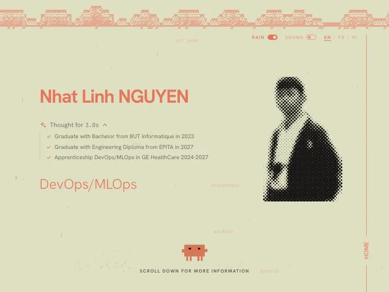
The portrait on the site isn’t ASCII anymore. I replaced it with HalftoneReveal, a component from React Bits, rewritten in plain JavaScript. It draws my photo as a grid of dots on a canvas and can reveal it one column at a time, which is what the agent needed to “print” it. The ASCII side of the idea lives on in the cloud at the top of the hero (step 7).
2. The agent prints my portrait
Next I drew the Claude character using a few SVG rectangles. The first version slid across the page like it was on wheels. I wanted it to walk, so I changed the movement: alternating legs, a little hop and a lean with each step.
It walks along the top edge of the portrait while a beam underneath prints the halftone column by column, with little sparkles.
3. Surprise, then a rush to my name
After printing the portrait, the agent realizes it has forgotten my name. It jumps twice, gets a red “!” over its head, looks back and forth between the portrait and the empty name, and sprints away in a puff of dust. Then it comes back with a keyboard and types my name, complete with key sounds. This is probably more animation than a portfolio needs, but I enjoyed making it.
4. “Thought for 3 seconds”
I found the ThoughtLine component in the React Bits library. It’s the “Thinking… → Thought for Ns” block you see in AI chat apps, and Claude shows me exactly that every day, so it fit right away.
I first asked for a tiny proof of concept without setting up a new React app, just to see if the animation would work. It did, so I ported it to plain JavaScript. On the site the agent stands next to it and thinks (with a few hiccups) for three seconds, and the steps it thinks about are my real path:
- BUT Informatique, graduated in June 2024
- EPITA engineering programme, expected graduation in 2027
- Apprenticeship at GE HealthCare, since September 2024; now focusing more on DevOps/MLOps
5. My title, one letter at a time
For the “DevOps/MLOps” title I initially tried a kamehameha laser. It was funny in the preview, but the beam hid the actual words. I ended up with a letter toss instead. A box appears beside the agent, which throws the letters one at a time into place. They land with a squash and a few sparks. Once the box is empty, the agent kicks it offscreen.
6. Pushing things into place
The text and the portrait start a little off-centre. The agent leans on the text block and pushes it left in three heaves, sweating, then runs over and pushes the portrait right. Finally it jumps, opens a parachute and drifts down to “Scroll down for more information”.
If you click it after it lands, it gets angry and swears at you in censored symbols (#@$%!), with a different line
of a different length each time.
7. A cloud that rains DevOps words
At the top of the hero, an orange cloud made of block ASCII drifts across the screen and drops words like git push,
prometheus, grafana or pytorch. They fall onto an invisible floor at the level of the scroll hint and shatter.
There’s a switch to turn the rain off, and another for sound, which starts off.
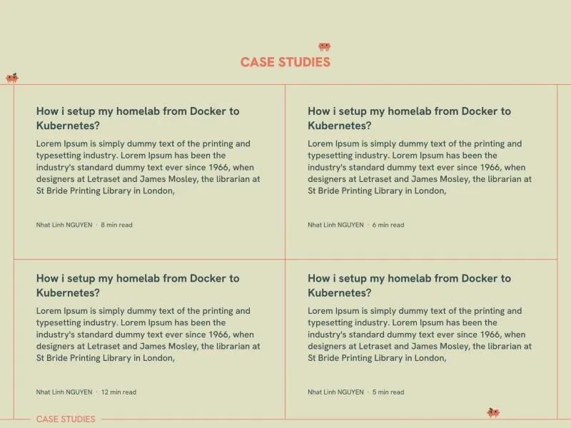
8. Case studies that get built
The case studies section is my favourite. One agent walks along the bottom of a card, hammering the border into place. Another works across the top in the opposite direction, at a different pace. A smaller one patrols above the “Case studies” heading. I spent a surprising amount of time getting those movements to feel right.
I kept only the frame lines and corner brackets so the cards have room, and put the section label inside the bottom line, like the legend on a diagram.
9. The colours and the rest
I kept the colours from that first note: pale yellow for the background, orange for the accents and dark text.
Orange is my favourite colour, so it was always going to be the main one, and I found the full palette on Pinterest.
The contact section reverses them with an orange background and light lettering. I also added French and Vietnamese
translations. The serif I use for accents, Young Serif, has no Vietnamese characters, so the Vietnamese pages load
Petrona instead. I also adjusted the layout for 2K and 4K screens and fixed
overflowing text on mobile. With prefers-reduced-motion, the animations are skipped and the finished layout appears
immediately. The site runs on Cloudflare Workers.
Results#
- of 3D, down from a 14.2 MB model
- 0 MB
- of gzipped JavaScript for the whole home page
- ≈ 30 KB
- languages: English, French, Vietnamese
- 3
Astro generates the HTML, and plain JavaScript handles the animations. There’s no framework runtime or loading screen. Visitors who prefer reduced motion see the completed layout straight away.
There’s still work to do. The portrait image is now the heaviest asset at around 480 KB, which is a lot for a photo I’m going to turn into dots anyway. I want to shrink it. Several case studies are placeholders too, and I’d rather fill those properly than rush them.
What I learned#
I still like the old portfolio, and I haven’t stopped caring about how websites look. I just want the first thing people see to make sense for the engineering roles I’m pursuing. The little agent took a lot more tweaking than I expected, but it gives the page some personality without bringing back the 14 MB room.
I also nearly forgot that the whole project began as a rough note on my commute. I’m glad I kept it.